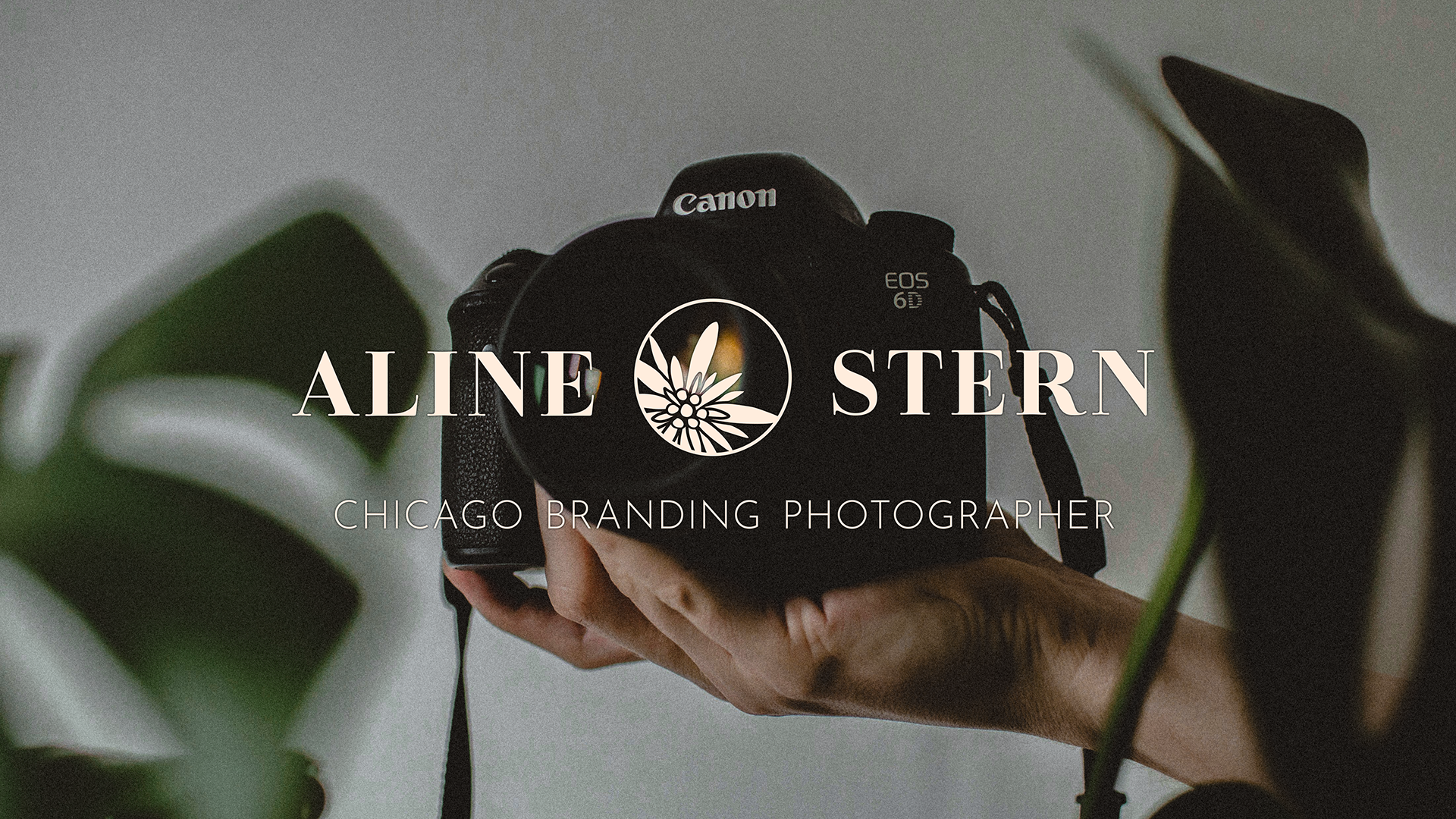
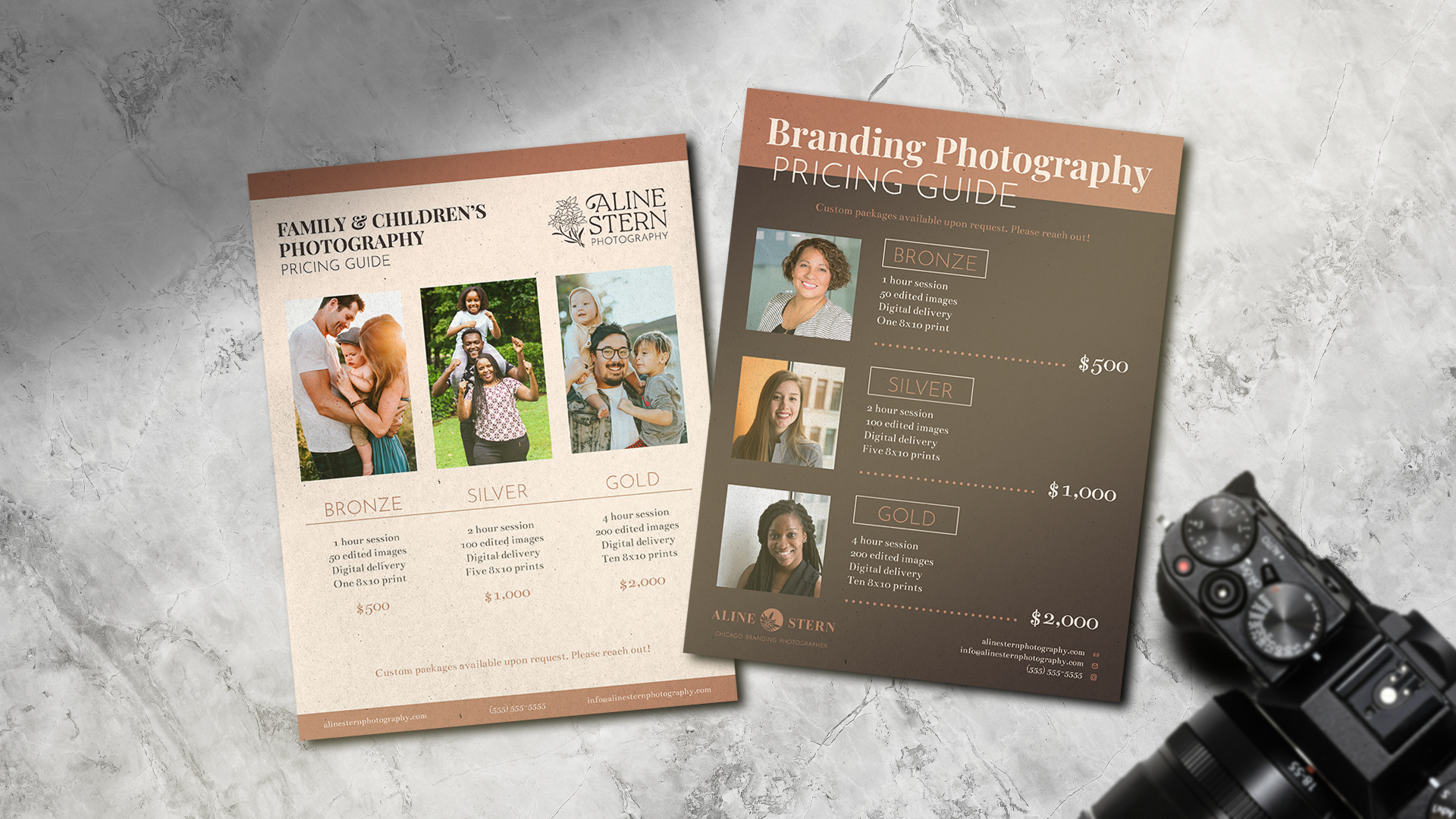
I was recently approached by a local photographer who needed some help expanding her brand. A long time children’s and family photographer, Aline had recently moved into the Brand and Headshots space. Additionally, her old logo no longer reflected her business. Her goal was the end the process with two new logos: one for her children’s and family photography, and one for her newer branding photography business. She also wanted a cohesive color palette, type pairings, and business cards for her new branding business.
Having little experience with photography myself (outside of a brief phase in high school), I sought to learn as much about the industry as I could. What kind of brands were out there, and how would a photographer split their business into two sides? Ultimately two separate logos was the solution, which meant they needed to be distinct but still look like they belonged to the same umbrella company.
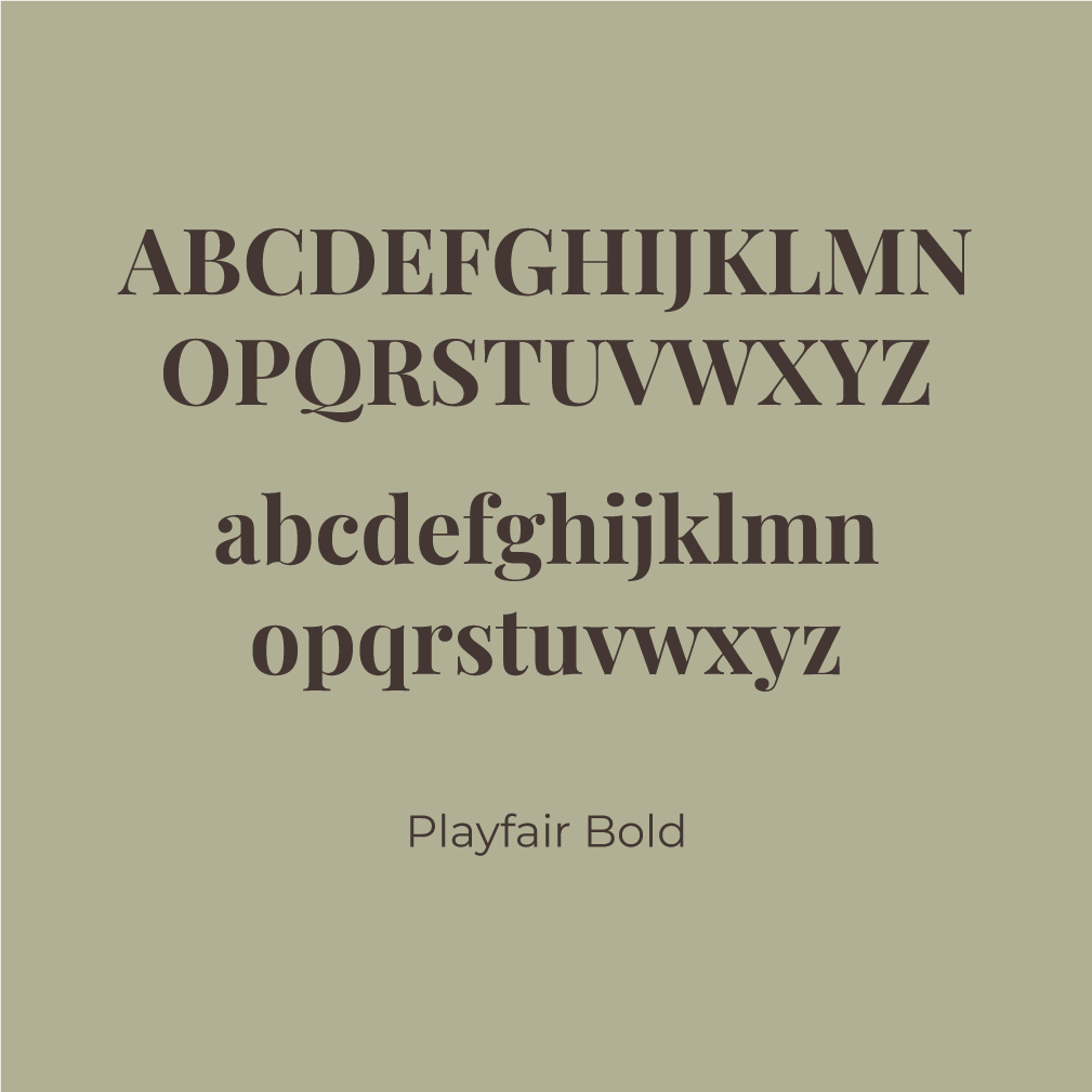
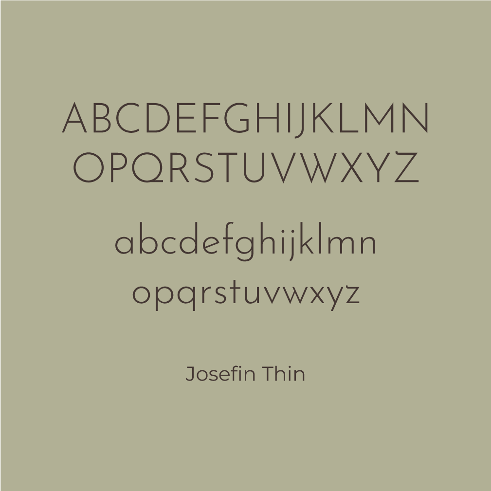
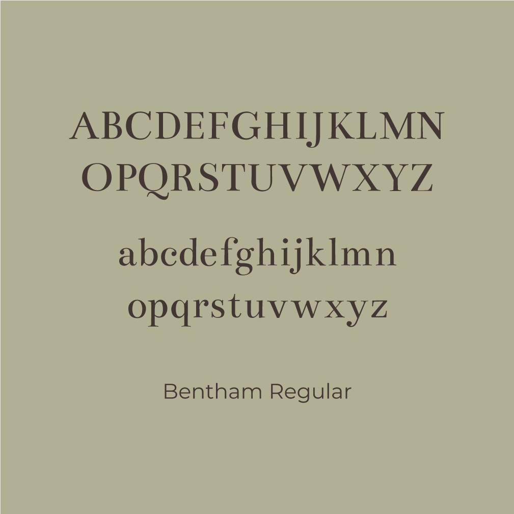
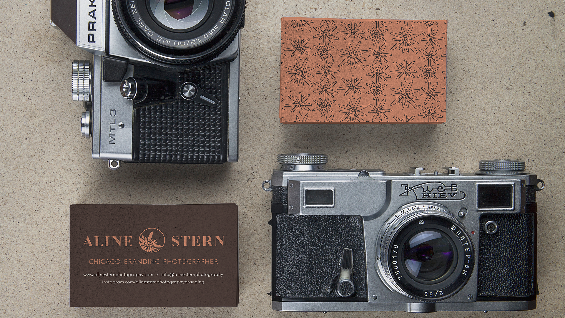
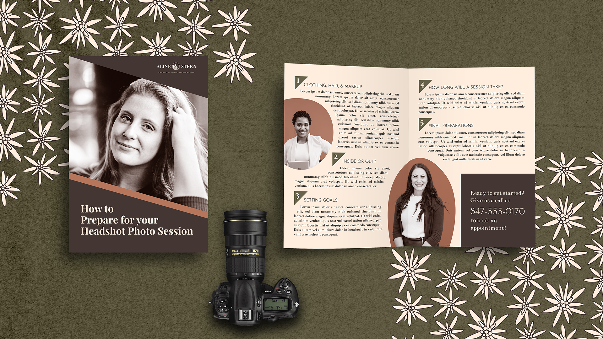
Inspired by Aline’s Austrian heritage, I incorporated bespoke edelweiss illustrations into both logos. The typography is united with a sans-serif typeface. The main serif in each logo was chosen based on the personality of each brand: the children’s and family photography needed something lighter and friendlier, while the branding photography was in a position to be more bold and professional. As a bonus for this portfolio, I threw in some promotional material to help expand on the final visual identity more.